
Top performers all have one thing in common, they can visualize success. They can see a mental picture of themselves being the best. Muhammad Ali constantly stressed the importance of seeing himself victorious long before the fight. Today, sports teams gather before a game. They review stats, videos, charts, and all sorts of data to prepare for their best chance of success. Athletes are taught today to picture themselves performing at their highest level before the game even begins.
We have all heard the cliché, “a picture is worth a thousand words.” Visualizations have become common fare in business. It started with spreadsheet charts and graphs and are now fully interactive applications. If you have ever looked at a gas gauge, you get the concept of visualizing data. Research suggests over 90% of all human communication is visual. Studies also show the human brain processes images faster than text. Are you getting the “picture?”
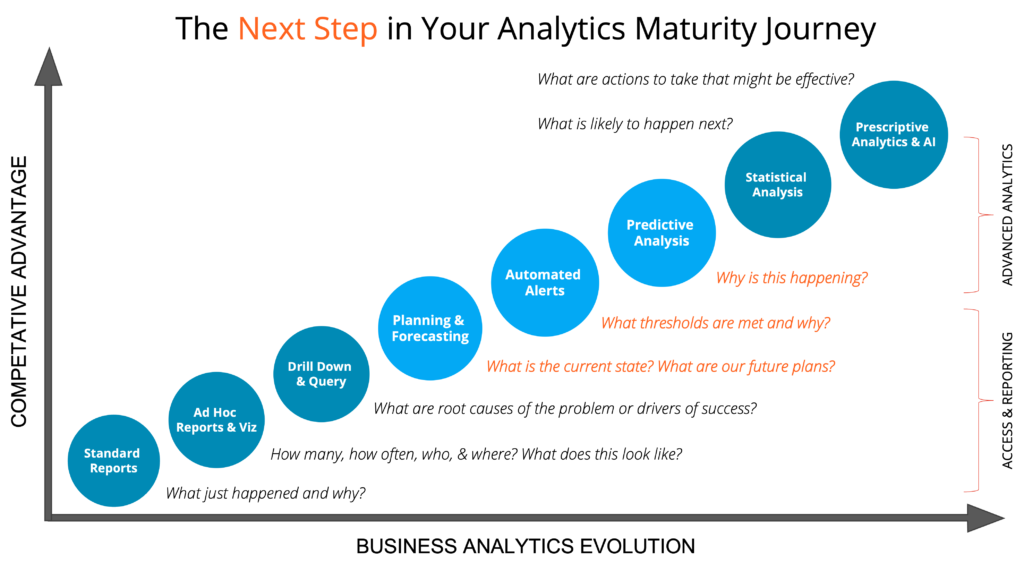
There are lots of stats and data available in any organization. Businesses are in the game to be profitable and to offer a useful good or service. To be successful, one must measure many different areas of the business. Sales and revenue are paramount; however, a sloppy, inefficient operation will impact the business negatively. Visualizations are only the beginning of a business’ analytics journey, but they are the foundation if leaders and managers are truly making data-driven decisions.
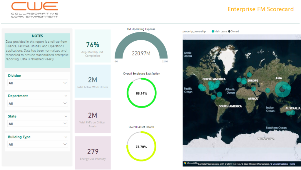
Now turning the conversation, how can a business use the visualization of data to impact Technical Operations? First, let us establish the definition of Technical Operations. This is the hardware, software, and facility infrastructure associated with the delivery of goods and services to a business’ customer. Hardware includes computers, networking equipment, process control units, sensors, meters, and a host of other types of equipment. Software includes any computer application deployed to support the operation. Facility operations cover items such as buildings, space management, power and utilities, environmental controls, and several others.
Simply knowing the count of things across Tech Ops is a good start, but static reports produced by the accounting department are no longer the only way to monitor your organization. We can now deploy interactive dashboards designed for touch–screen use on mobile devices, giving people a way to do on–demand analysis. Consider the ability to not only view historical performance, but to also see predictable models based on a variable set of inputs. These views allow you to spot areas in need of attention before the issues arise, transforming a reactive approach to being proactive.
Think of the value in creating visualizations that present data and make decisions in ways that may have not been thought of previously. One company uses weather data in conjunction with office calendars to set power and environmental controls in office buildings to minimize their power consumption, thereby optimizing their carbon footprint and lowering utility spend. Another company has optimized their software license footprint against actual utilization, saving them thousands a year in unnecessary costs. The two use cases are vastly different in complexity, but both are examples of using visualizations that had not been thought of before in those organizations and affecting positive change in their Technical Operations.
Trends and issues are more easily identified when data is visualized. Data visualization provide more actionable items. For instance, if the number of issues being logged increases and is visualized by category and by submitter location, it is easier to see if the trend reflects the type of problems or the location of the problems or both. A graphic showing these trends allows an operator to act towards the most probable cause of the issues. This focuses resources, saves money and time.
Rushing in to stand up some charts and graphs is not recommended. First ask some basic questions.
- Who is my audience?
- What key performance indicators are important for them?
- What do users need in terms of interactivity?
- What is the expected outcome: Reporting, Decision Making, Education?
Use a methodical approach in understanding your data sources and their respective capabilities for data sharing. Once complete, begin building a data model that allows you to map and correlate the data across systems. With your data model in hand, there are various techniques to begin your data journey. A simple pie, line, or bar chart is a good place to start. Use slicers or pick lists to fine tune the data to a specific date range or product line. Scatter plots and maps have become especially useful in many industries and use cases. Diagrams and matrices are used to display more complex data with many variables at play.
There are many technology offerings to help in visualizing data. They range from free to expensive and facilitate a varying array of functionality. However, a stable, sensible data model is the most important aspect in which to invest your efforts. Remember, garbage in, garbage out. Implement a good data cleansing, mapping, and transformation process. This will provide the best source of data from which to draw conclusions and predictions. Once a data model is in place with good change management and continual update processes, it is easy to continue to more advanced analytics with machine learning and artificial intelligence.
Metrics like Uptime, Cycle Time, Power Consumption, License Counts, Utility Costs, and Device Counts are some of the basic measures. As you begin to lay in multiple data sources and map the data to a more standard dataset, users can then drill down and get a more specific view of correlations never realized. Understand mean times between events, begin to apply indexes to service events and staff turnover. Have the insight needed to optimize technical operations and fine tune the delivery of services with more focus and intent.
In summary, first, picture yourself dominating your market, and running an extremely successful business. Then begin to visualize your data in ways you may have thought were not possible. Data visualization empowers an organization to get the greatest value from its captured data. There is a vast amount of data available to even the smallest business.
Do not miss the opportunity to gain a competitive advantage in your market. The real value of any data lies in your ability to correlate it across systems and understand it. To do that, a methodical approach and data visualization is an absolute must. Pulling all this data together can be complex and is conducted via manual processes in many cases. However, with the right partner, technology stack, and an effective data visualization program, that effort does not have to be wasted.
Comments are closed